 mathisworks case studies
Risk Dashboard
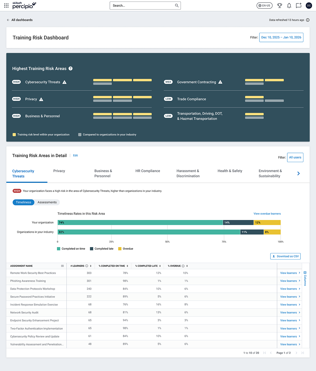
Goal: Give HR and learning leaders visibility into organizational training risks, surfacing skills gaps in areas like cybersecurity, and empowering them to target training to their employees.
My role
- Principal Product Designer
- End-to-end ownership, from concept sketches to final visual design and QA
- Close collaboration with Product, Data, and Research
Challenge
- No prior visualization for these new data sets
- Needed to communicate risk severity and industry benchmarks clearly
- Had to balance transparency (admin insight) with data privacy for learners
Approach
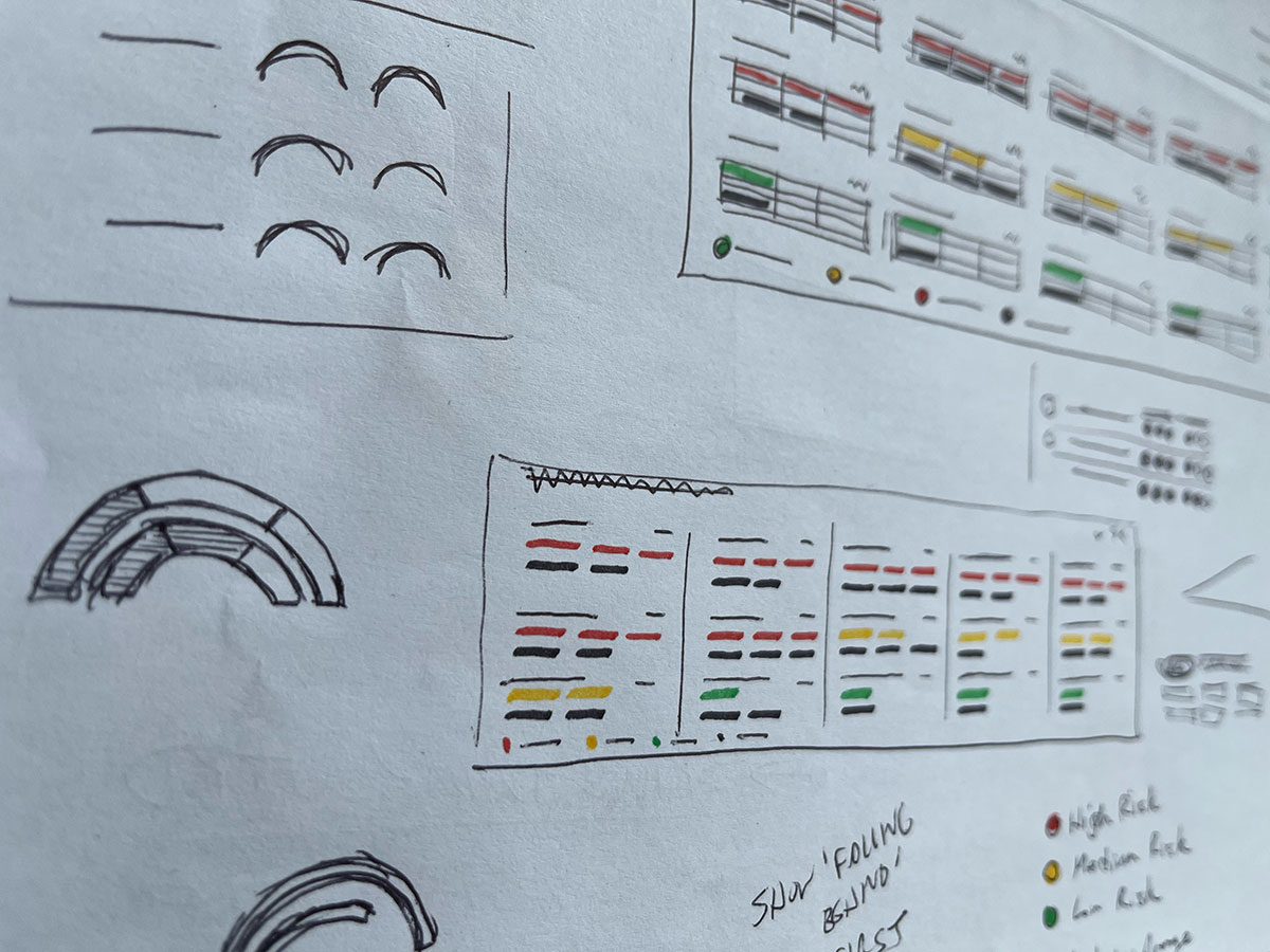
Rapid concepting
- Sketched on camera with UX partners to explore visual metaphors (gauges, chips/tabs)
- Designed an approachable dashboard UI showing skill gaps by topic
- Early high-fidelity concept gained executive attention and buy-in
Scaling for complexity
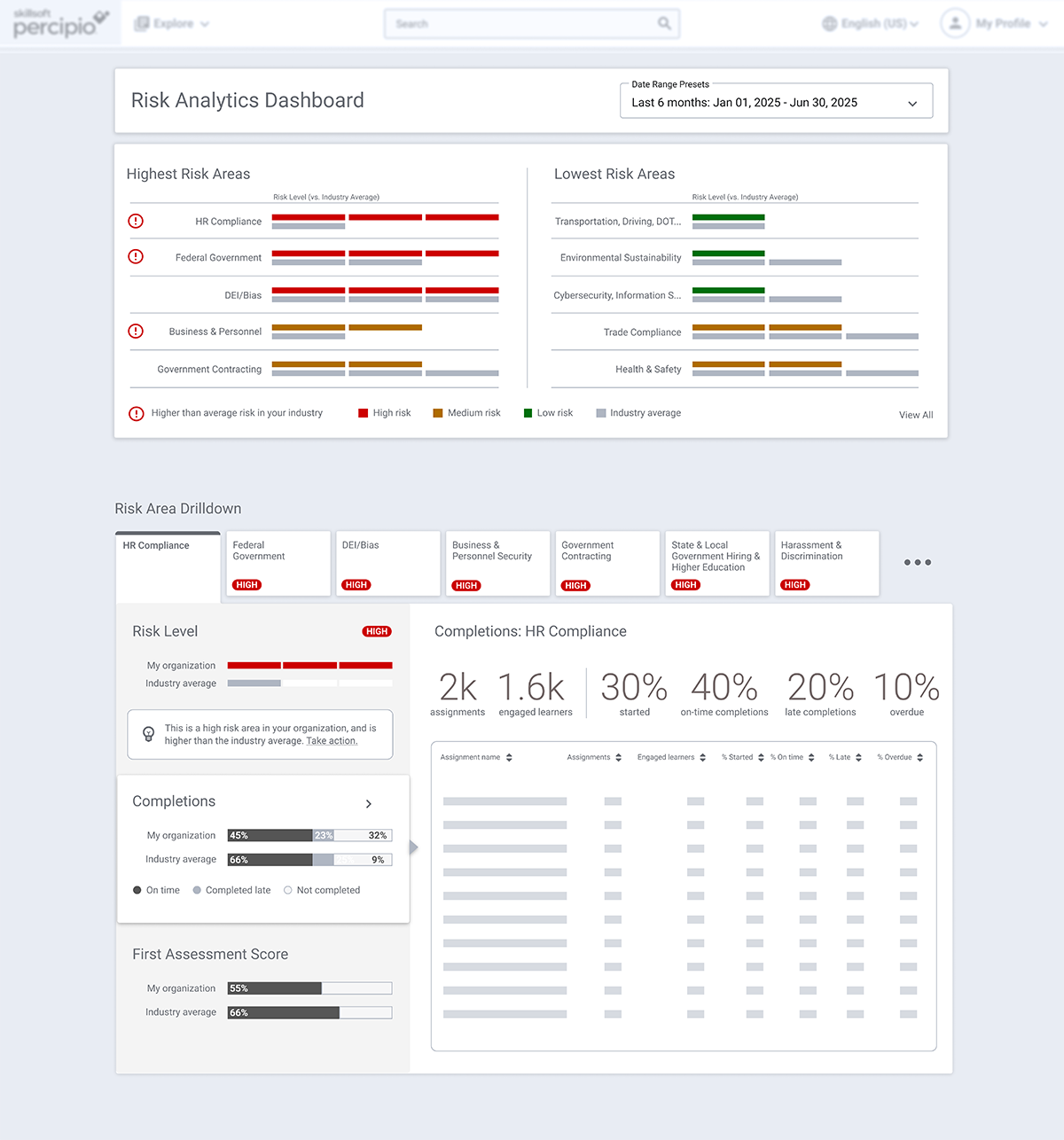
- Collaborated in Miro to expand design from 3-5 to 15+ risk areas
- Introduced rank logic: low / medium / high risk + industry comparison
- Preserved the “chunky tab” navigation pattern stakeholders loved
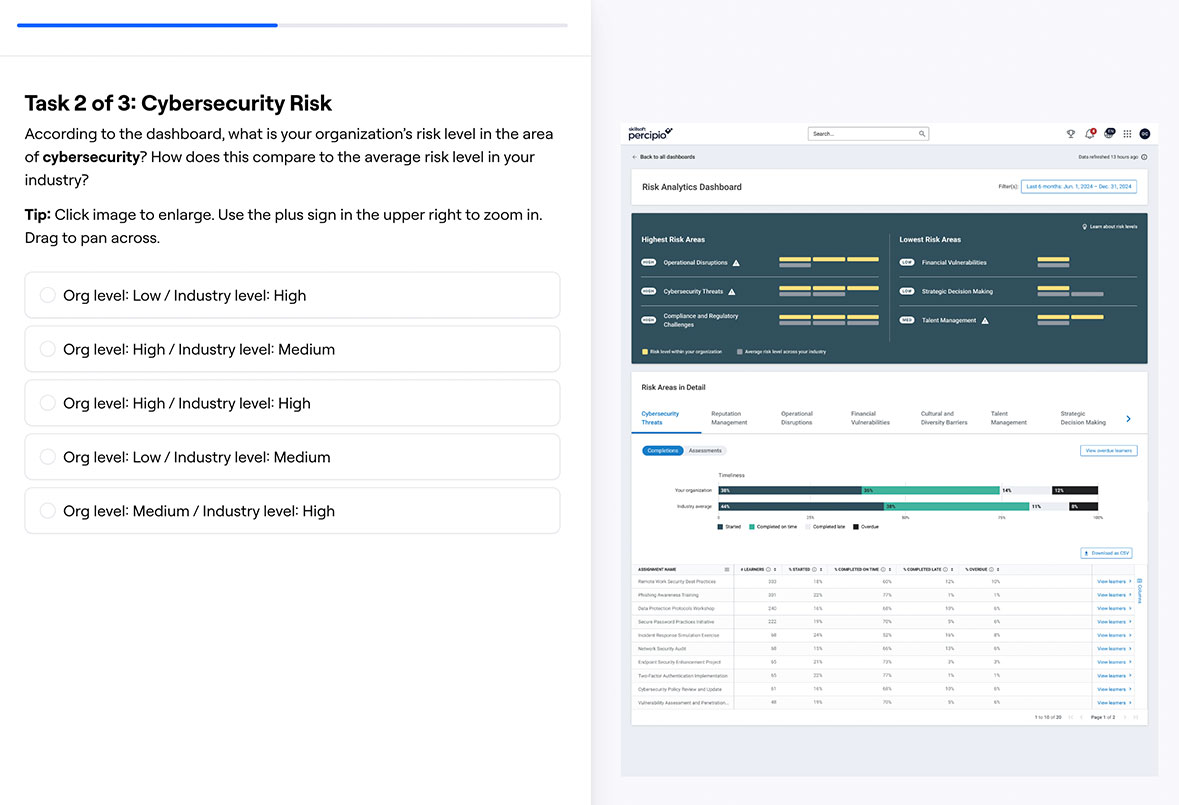
User feedback and validation
- Ran mid-fi tests via Figma + customer panel (HR admins, CLOs)
- Key insight: admins wanted personal communication options with learners
- Follow-up Maze study measured clarity, usefulness, and missing info
Refinement and synthesis
- Used Azure AI to summarize qual + quant findings efficiently
- Designed empty and partial states for data variance
- Renamed “Risk Dashboard” to “Training Risk Dashboard” to clarify scope
Outcome
- Prototype recognized by senior leadership for clarity and visual strength
- Established visual standard for future dashboards
- Helped bridge data visibility and training action, turning insight into engagement