 mathisworks case studies
Certification Data Dashboard
Goal: Enable HR and Learning admins to track employee progress across certification programs, revealing blockers, completion trends, and actionable next steps, primarily communication to learners.
My role
- Principal Product Designer
- UI design, prototype testing, and research synthesis
- Collaboration with Product, Engineering, and specialized UX Research
Challenge
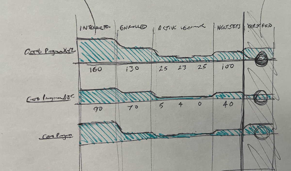
- Every certification followed a unique path; we ultimately could not show a standard set of phases in the journey
- We needed a scalable visualization that didn't overwhelm users
- Late research meant aligning the team while the design was already underway
Approach
Framing & Early Design
- Starting with a sales funnel visualization, I pivoted to simpler “percent completion” model
- Added an executive summary section to orient and engage users
- Conducted customer poll + survey to capture true admin goals
User Research
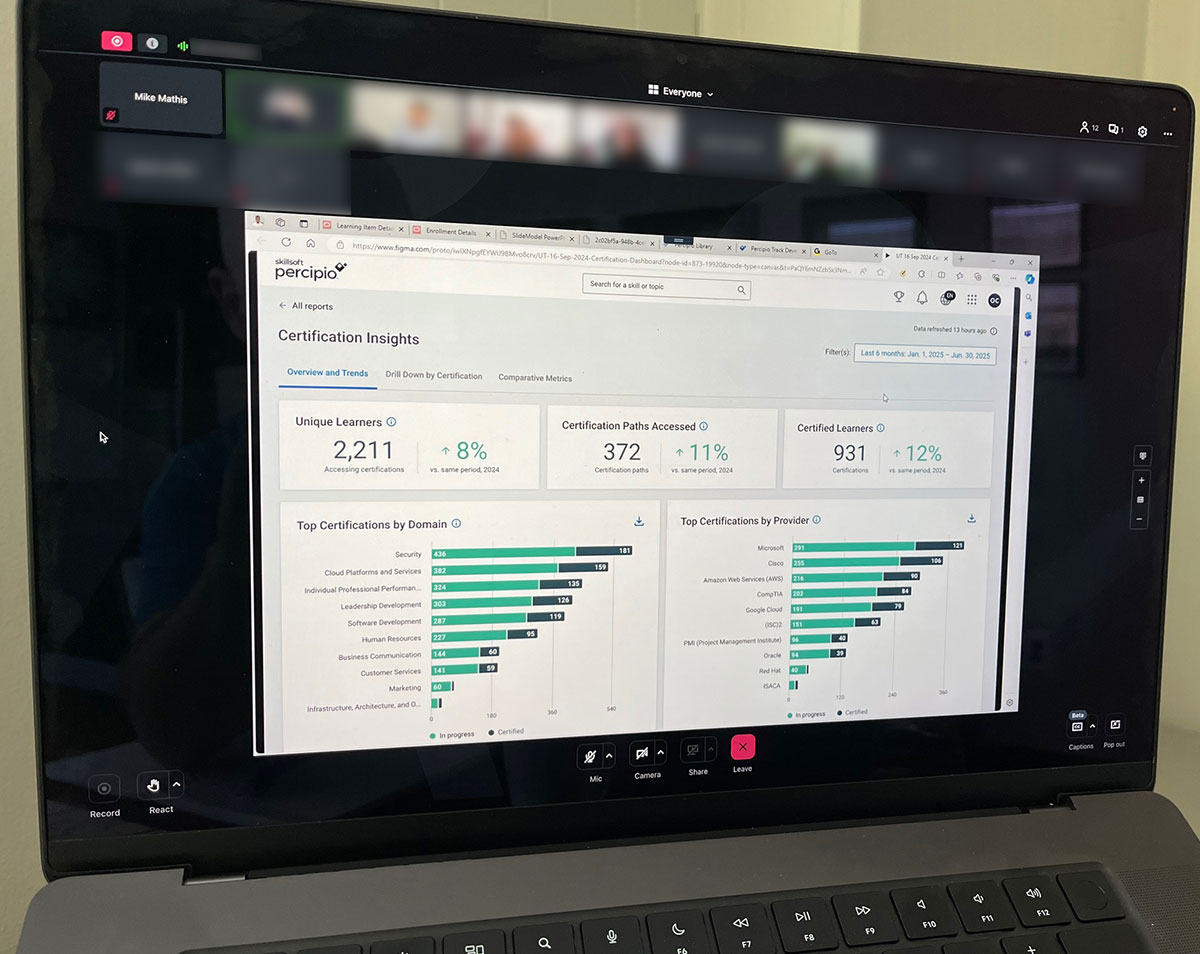
- Partnered with UX Researcher to run 3 test rounds + 2 design-partner sessions = 30 total admin participants
- Synthesized findings in Dovetail + Miro for shared visibility
- Validated the need for an overview, a hierarchy drilldown, and the ability to export data
Iteration & Design Refinement
- Redesigned wireframes in Miro with Product and UX leadership
- Rebuilt in Figma using standardized components
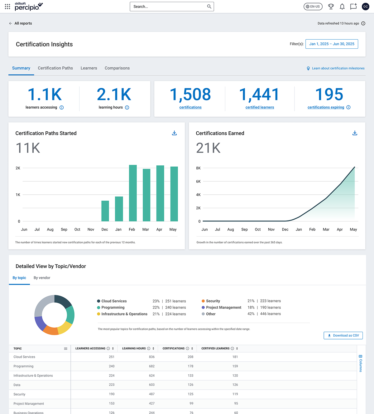
- Simplified data hierarchy and clarified key metrics, e.g., “certifications achieved,” “learners certified”
- Flattened visual structure; tied charts closely to tables for easier interpretation
Outcome
- The iterative approach increased clarity, reduced noise, and ensured a validation of the information hierarchy
- Post-launch enhancements: learner-level view + full-screen certification viewer
- Success was tracked through usage analytics and continuous feedback