Learning App Overhaul
Challenge: Mobile learners were satisfied with content but struggled with usability. Only 55% found the app easy to use. Issues included login friction, inconsistent UI, poor content discovery, and unclear progress tracking.
Goal: Simplify the experience, modernize the visuals, and make mobile learning easier and more engaging.
Approach
Research
- Surveyed 377 users to identify pain points
- Compared key learning apps like Duolingo, LinkedIn Learning, Mimo, and Coursera
- Immersed in real learner behavior to inform design decisions
Design
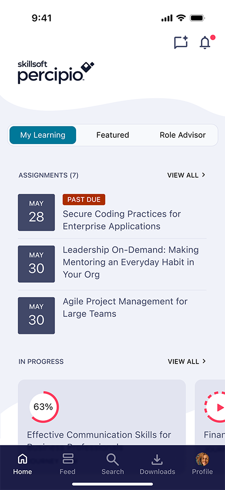
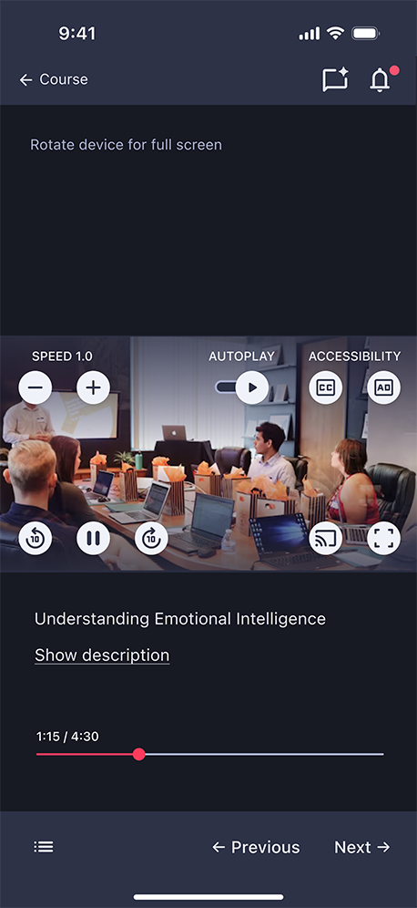
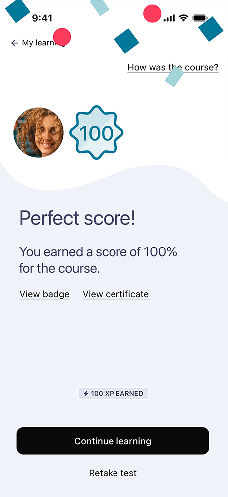
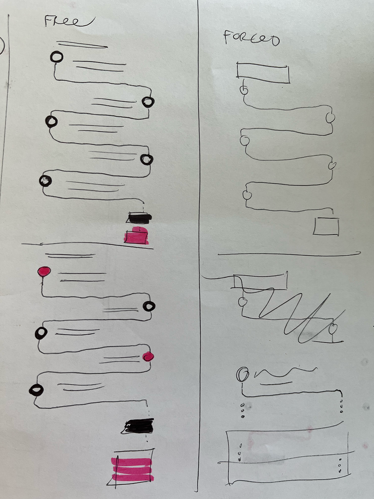
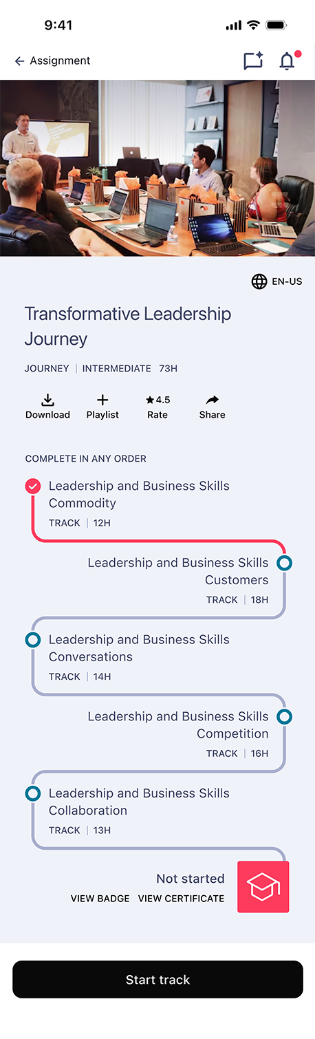
- Created new navigation, learning journey, and assessment flows
- Simplified layouts and introduced a balanced, business-friendly style
- Defined color, type, and dark mode systems ready for white labeling
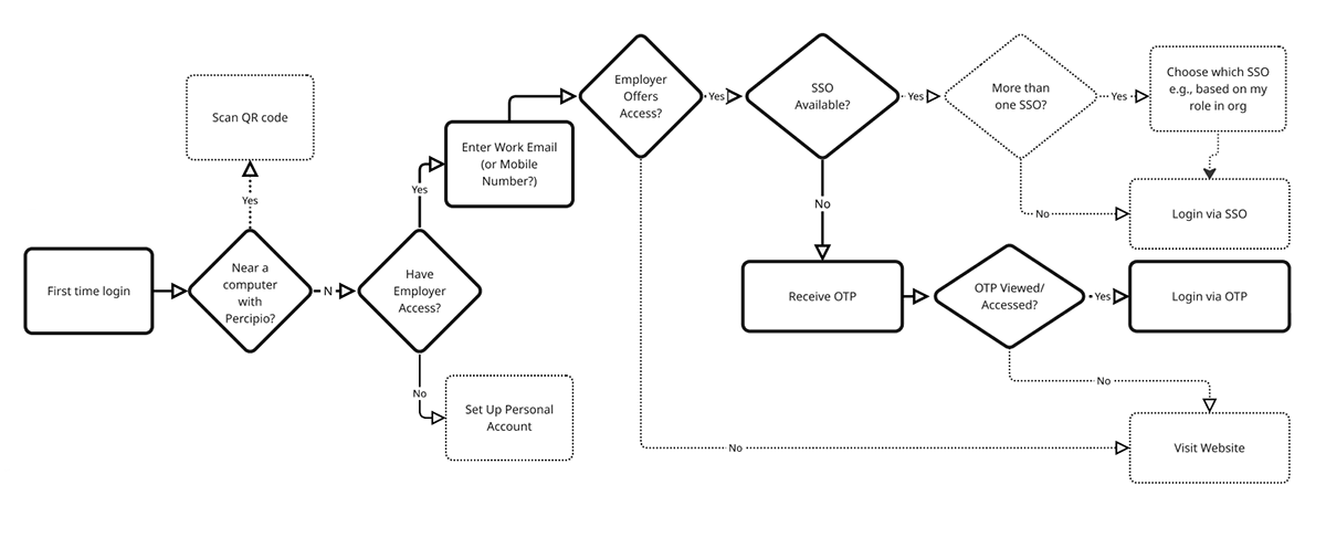
- Redesigned login with SSO, OTP, and QR options in one clear flow
Testing and Collaboration
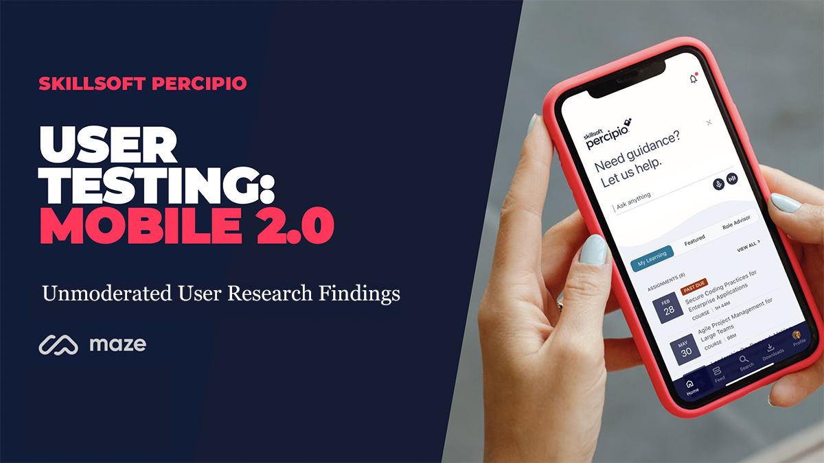
- Tested via Maze with 100+ learners to evaluate the new design
- Improved icon clarity and homepage usability
- Partnered closely with engineering to ensure implementation quality
Results
- Clearer navigation and faster task completion
- Simplified login and fewer support issues
- Positive feedback on new design and dark mode
- Successful rollout of redesigned home and learning screens
- Established a scalable visual foundation for future mobile updates
 mathisworks case studies